Your website’s primary call to action (CTA) is the critical element that drives visitors toward taking your desired action, whether that’s making a purchase, signing up for a newsletter, or scheduling a consultation. For small businesses, choosing the right CTA can make the difference between passive visitors and engaged customers. Here’s how to determine your primary CTA and make it work effectively.
What Is a Primary Call to Action?
A primary CTA is the main action you want your website visitors to take.
Unlike secondary CTAs, which provide additional options (e.g., “Learn More” or “Read Our Blog”), the primary CTA is focused on achieving your website’s most important goal.
For example:
- An e-commerce site’s primary CTA might be “Shop Now.”
- A service-based business might use “Book a Free Consultation.”
- A nonprofit might ask visitors to “Donate Today.”
Questions to Determine Your Website’s Primary CTA
To identify the best CTA for your website, ask yourself the following questions:
- What is the main purpose of my website?
- Is it to sell products, generate leads, build an email list, or raise awareness?
- What is the most valuable action a visitor can take?
- What action leads directly to revenue, growth, or engagement?
- What do my customers need to make a decision?
- Do they need to schedule a demo, get a free trial, or receive more information?
- Who is my target audience, and what motivates them?
- Are they looking for convenience, value, or inspiration?
- What barriers might prevent visitors from taking action?
- How can I address those barriers through clear language, guarantees, or easy processes?
Here are 10 effective CTAs that can inspire your planning process:
- “Shop Now”
- “Get Started”
- “Book a Free Consultation”
- “Sign Up Today”
- “Try It Free”
- “Learn More”
- “Subscribe Now”
- “Download the Guide”
- “Join the Community”
- “Request a Quote”
Examples of Websites With Clear CTAs
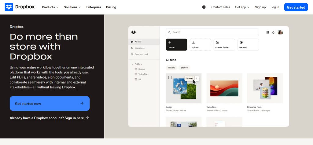
► Dropbox (www.dropbox.com): Uses “Get Started Now” to emphasize ease of access.
► QuickBooks (www.quickbooks.intuit.com): Focuses on “Get Started” to encourage immediate action, with a secondary CTA of “See Plans and Pricing”.

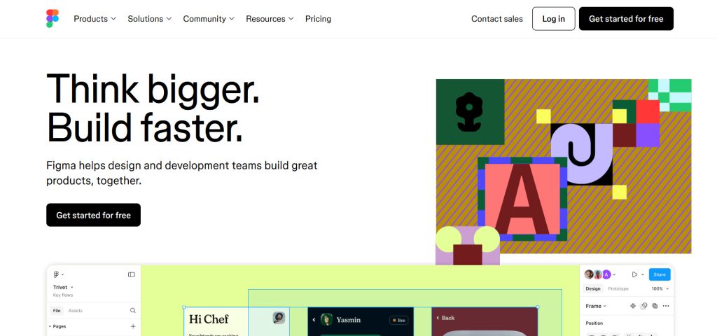
► Figma (www.figma.com): Focuses on “Get Started for Free” to encourage risk-free action.
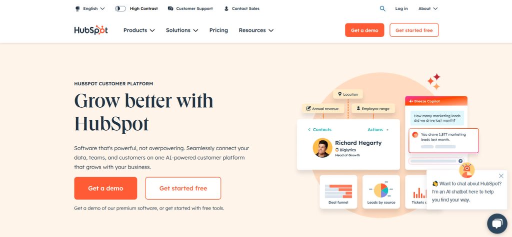
► HubSpot (www.hubspot.com): Prominently displays “Get a Demo” to drive engagement with their sales team, and a secondary CTA of “Get Started Free”.
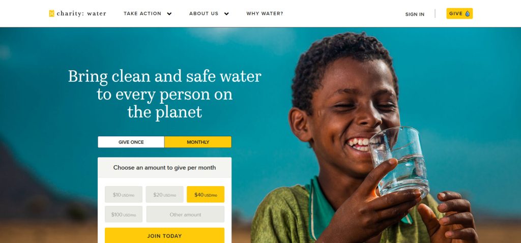
► Charity: Water (www.charitywater.org): Highlights “Giving” to support their mission.
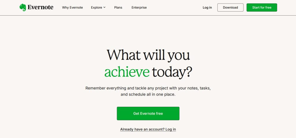
► Evernote (www.evernote.com): Features “Sign Up for Free” to drive risk-free sign ups.
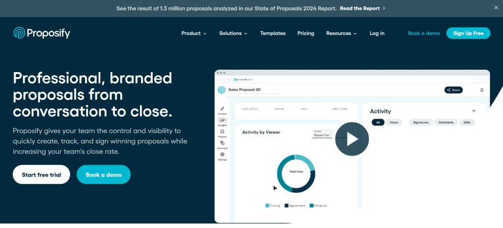
► Proposify (www.proposify.com): Features a primary risk-free CTA “Start Free Trial” and a secondary risk-free CTA “Book a Demo” to drive engagement with their sales team.
Tips for an Effective Primary CTA
- Keep It Simple: Use clear and direct language that leaves no room for confusion.
- Make It Visible: Position your CTA prominently above the fold and use contrasting colors.
- Convey Value: Highlight what the visitor will gain by taking the action.
- Create Urgency: Phrases like “Start Today” or “Limited Offer” can encourage immediate action.
- Test and Refine: Experiment with different wording, colors, and placements to see what works best.
Final Thoughts
Your primary CTA is the heart of your website’s strategy. By clearly defining your goals, understanding your audience, and crafting a compelling call to action, you can guide visitors toward meaningful engagement with your business. Use the questions and examples above to determine your CTA and create a website that drives results.

